
design System:
Designing once, scaling across five government applications
As a Senior UX designer at the Portuguese Tax Authority, I built a Design System. As a result, I delivered a scalable design system for five internal platforms.
Client
Portuguese Tax Authority
Period
2025
Project type
Design System
Components Library
Tools
Figma
Industry
Government
Finance
The process:
Building 30+ components
I developed the foundations and their primitives and tokens. I ensured colour contrast ratios and typographic style scale, following WCAG guidelines. I designed more than 30 components with properties such as role, state, size, etc.
To save time in the creation and development phases, I used the basis of IBM's Carbon Design System. I’ve done all the documentation in Storybook with design, code and info and I’ve maintained it in collaboration with devs to fix gaps and improve components.
Accordion group and items
Toggle properties
The outcome:
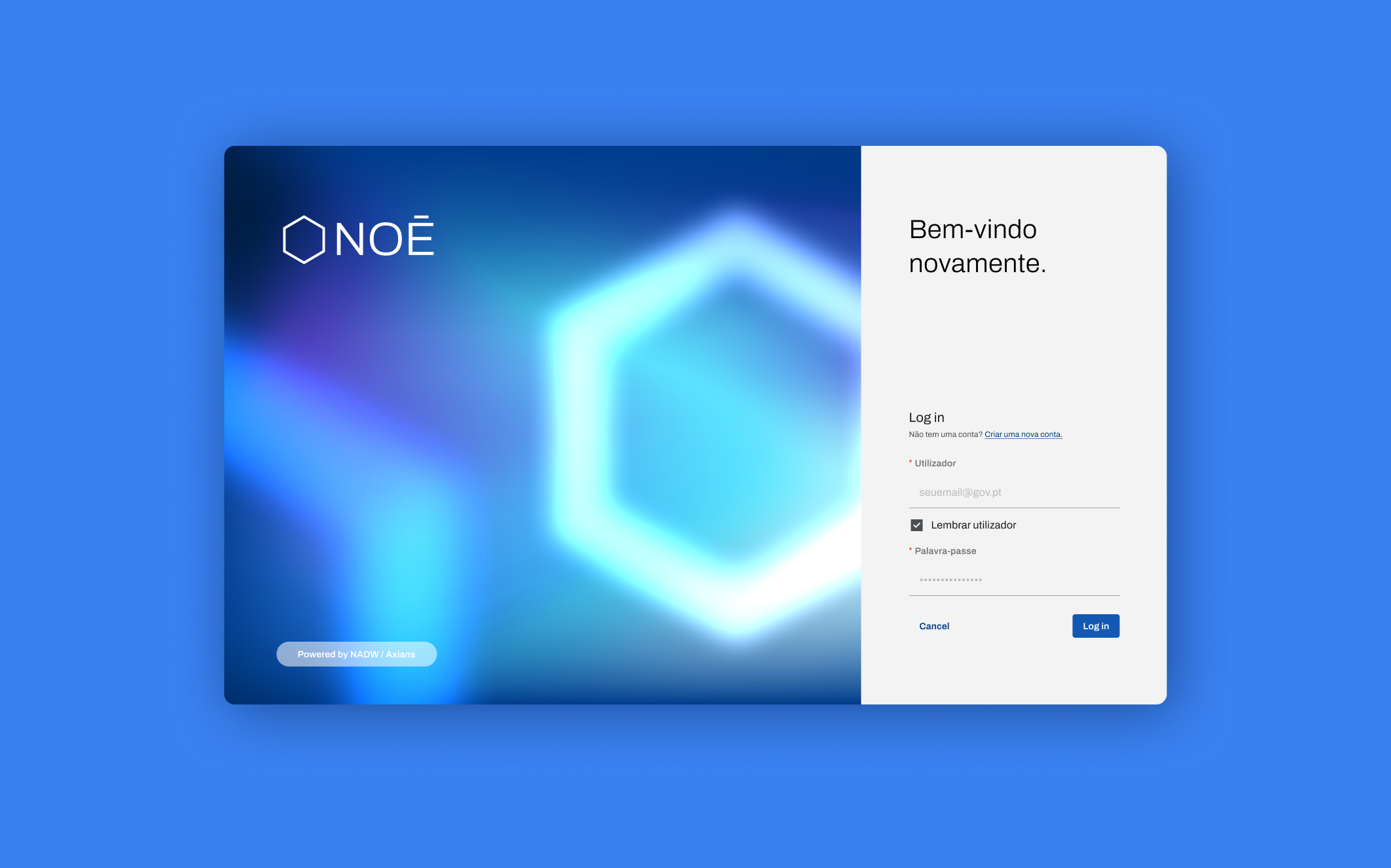
Already in production
The design system is already available for an anti-fraud application that is currently in the testing phase. It helped to create a more fluid experience for users, in contrast to the old application.
Now, I’m using Claude Code in VS Code and Figma MCP to fix new gaps, create new components and update the documentation. In the following years, the design system will be launched for four more applications from the Tax Authority, creating the same seamless experience for these apps.
