Redesign of the medical coding application
Redesign application.
SITUATION
The medical coding application was essential for doctors to manage hospital coding tasks within Portugal’s National Health System. Over time, the system had become increasingly complex and unintuitive, leading to frustration and inefficiency. Doctors reported difficulties locating their assigned tasks and a lack of clarity in workflows, which directly impacted productivity. In addition, a new design system had to be implemented across the National Health System’s internal platforms.
Interview script for the first session with doctors.
Diagram created with stakeholders to define the priorities of the application's flows and features.
TASKS
The main goals were to reorganize the information architecture and redesign the interface of key workflows to better support doctors in their daily activities. This included improving usability by defining clear rules and patterns through the use of components from the government’s internal Design System. When necessary, new components were created to fill gaps in the existing library. Another important focus was ensuring accessibility and compliance with WCAG 2.1 level AA guidelines.
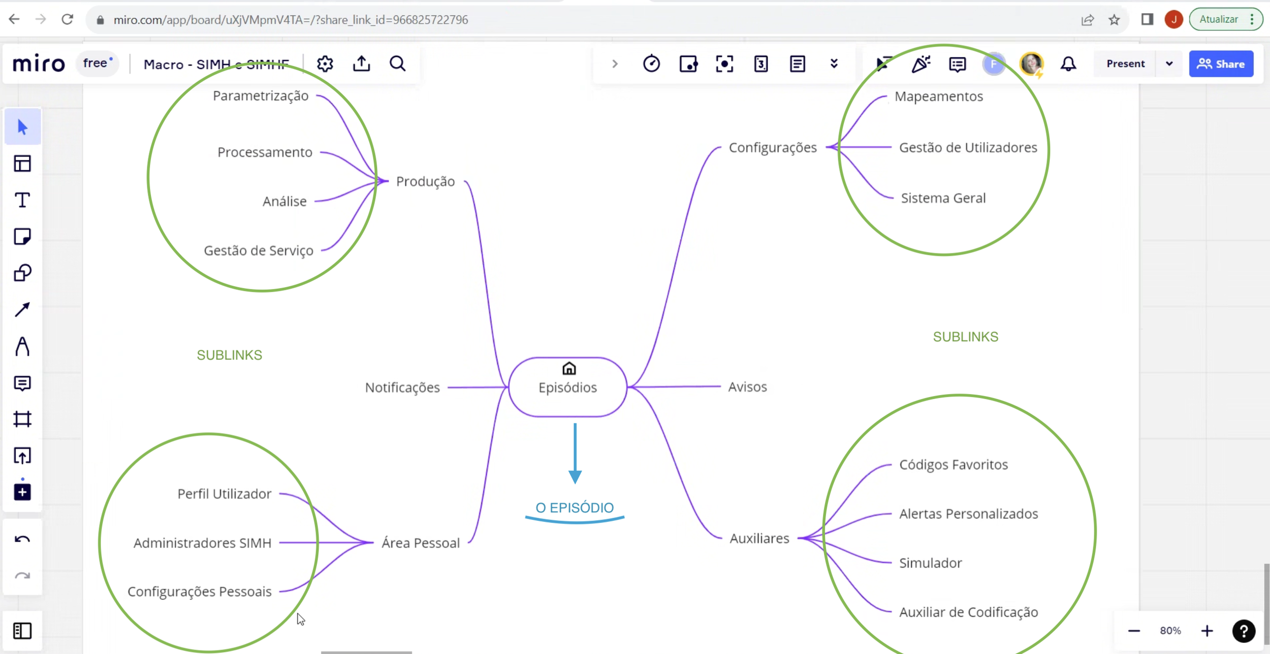
Initial thoughts on the application structure
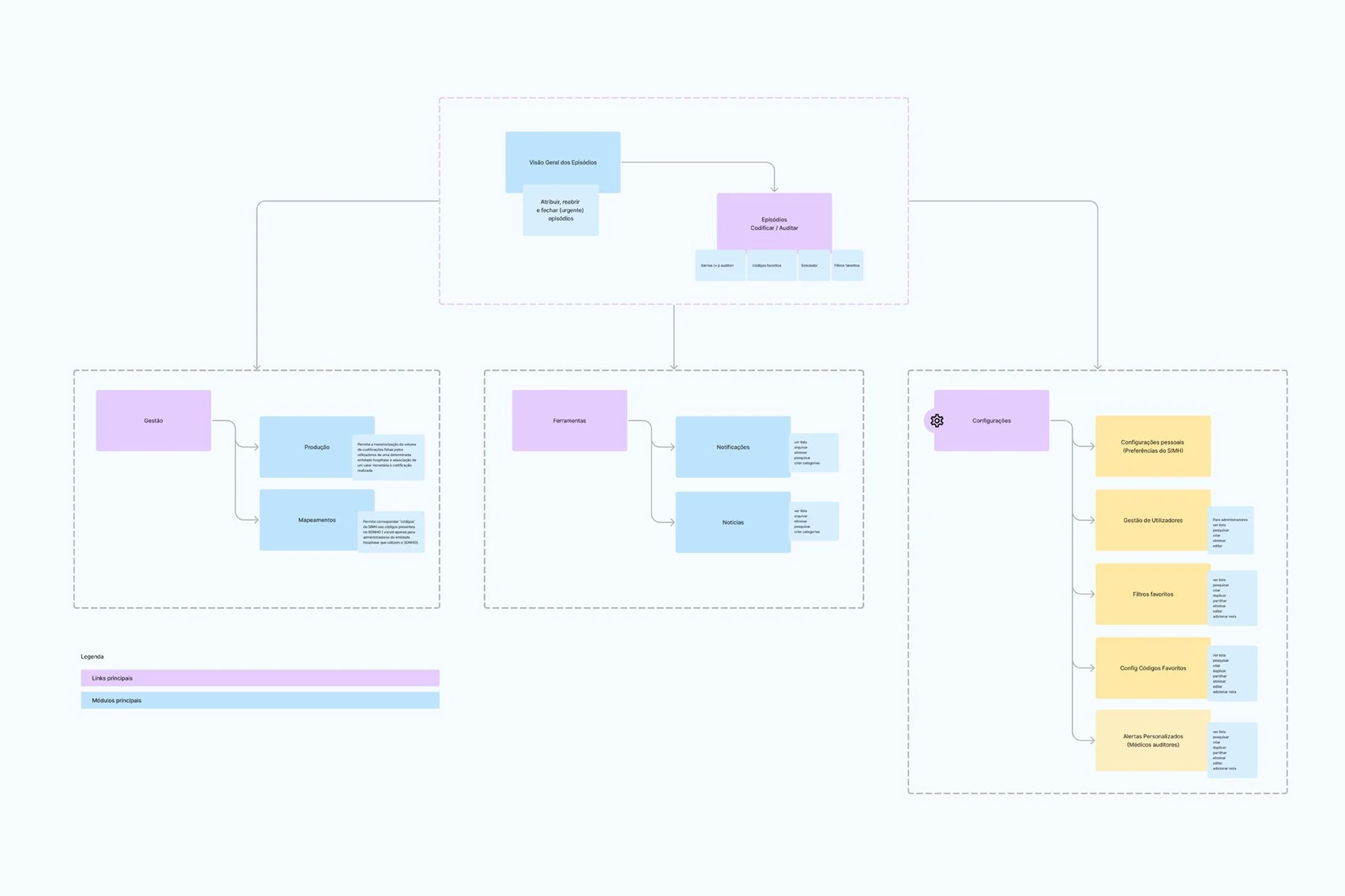
Proposal for new application structure.
ACTION
Together with stakeholders, we defined the priorities for key workflows and the initial features to be developed. To better understand user needs, pain points, and behaviors, interviews were conducted with doctors. Based on these insights, I created flowcharts outlining the new platform structure and developed wireframes and high-fidelity and interactive prototypes. Throughout the process, I participated in client meetings and led the presentations of the proposed solutions.
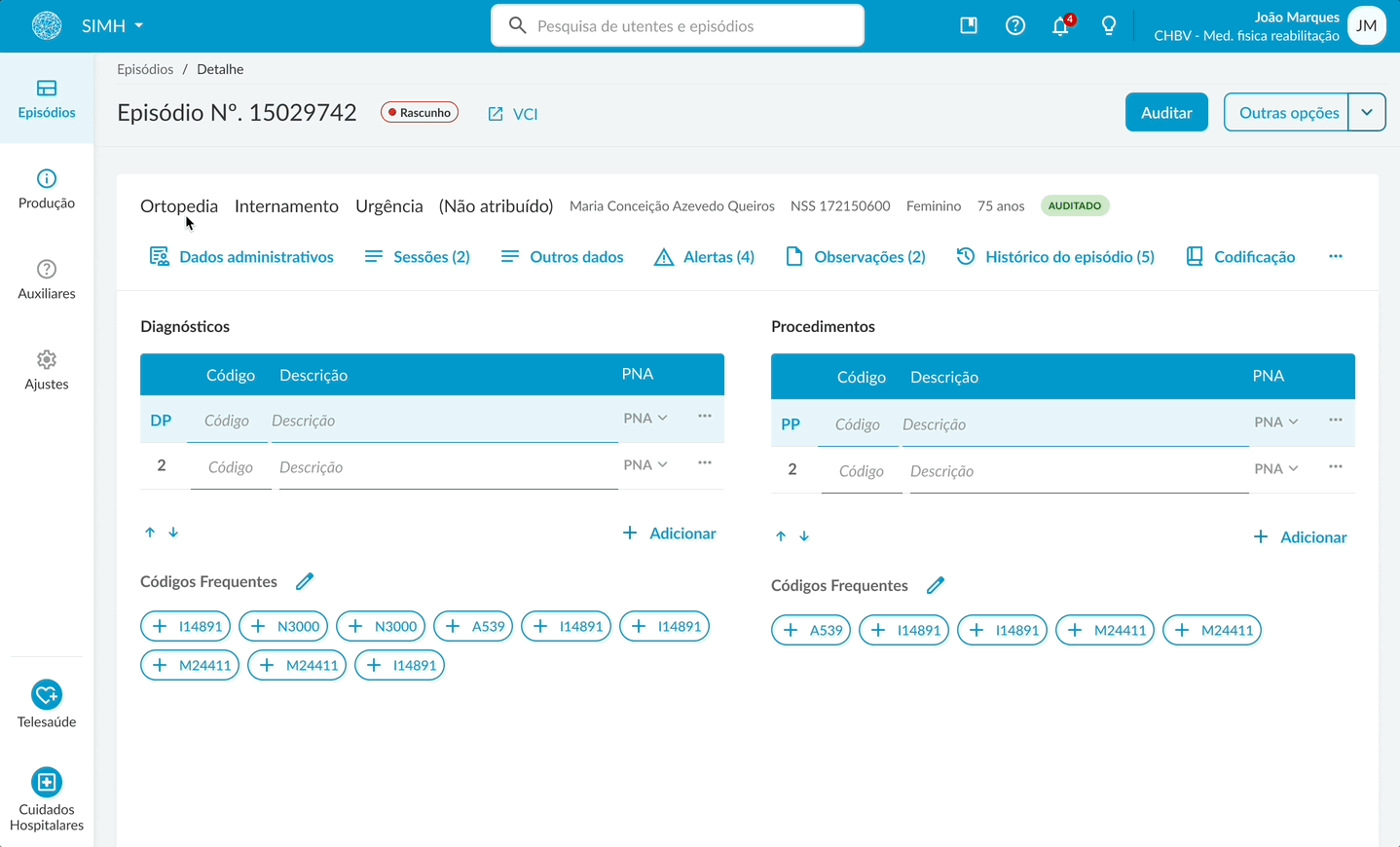
The main design proposals included a personalized task list flow for, highlighting the most relevant tasks; clear visual calls to action for quick access to priorities; a redesigned search interface with advanced filters in a modal to reduce visual clutter. Within the coding flow, a toolbar containing all frequently used features to minimize cognitive load. Usability tests were also carried out to validate the task and coding flows.

Wireframe task list

Wireframe medical coding

Wireframe taks overview

Wireframe settings
RESULT
Initial feedback was positive, showing reduced frustration and improved operational efficiency. There was a significant decrease in cognitive load during the coding process. The adoption of the Design System increased scalability, accelerated development, improved usability, and ensured compliance with WCAG 2.1 level AA accessibility standards. Rules, patterns, and components were applied consistently across different scenarios, resulting in a more coherent and uniform user experience.

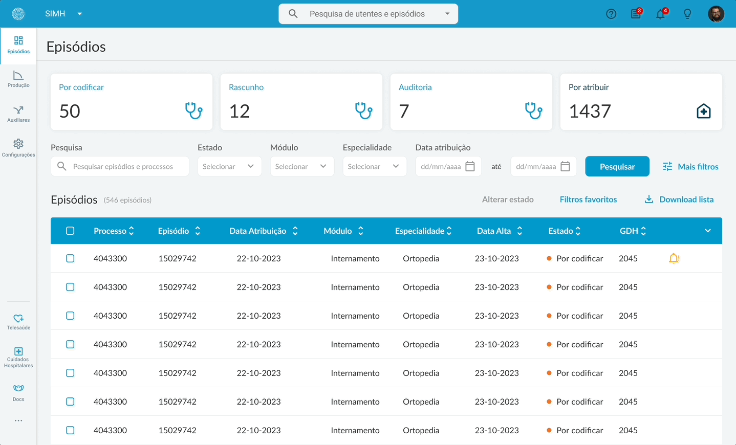
In the old version, doctors had to search for their tasks.

The new task list flow.