Triton Timber Group
I created the brand's visual identity and guidelines. The logo was inspired by the diagonal cut of trees. The result is a "T" made up of three different wooden modules, which represent the reuse of wood to create a new piece. The colours will have three different uses: in the corporate environment, in the workplace and in Triton's marketing.
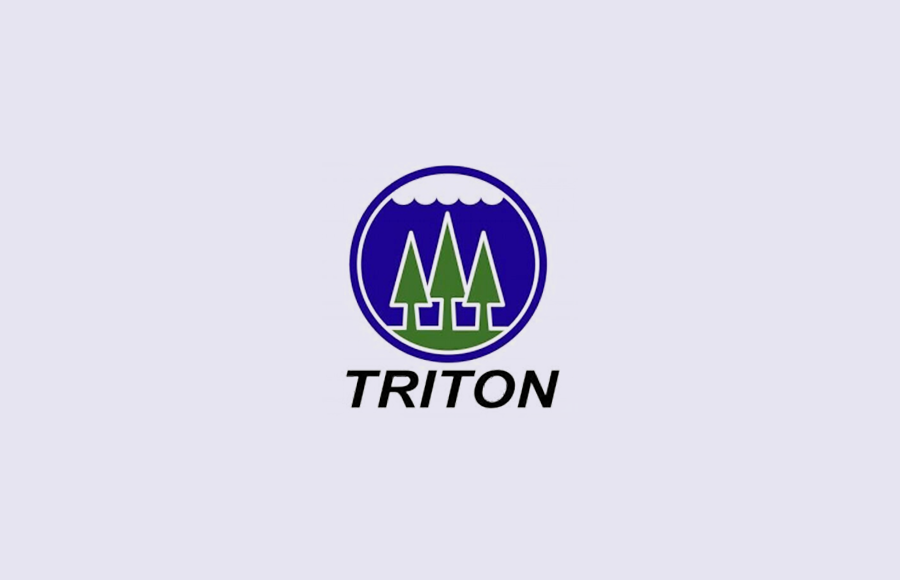
Previous version of the brand
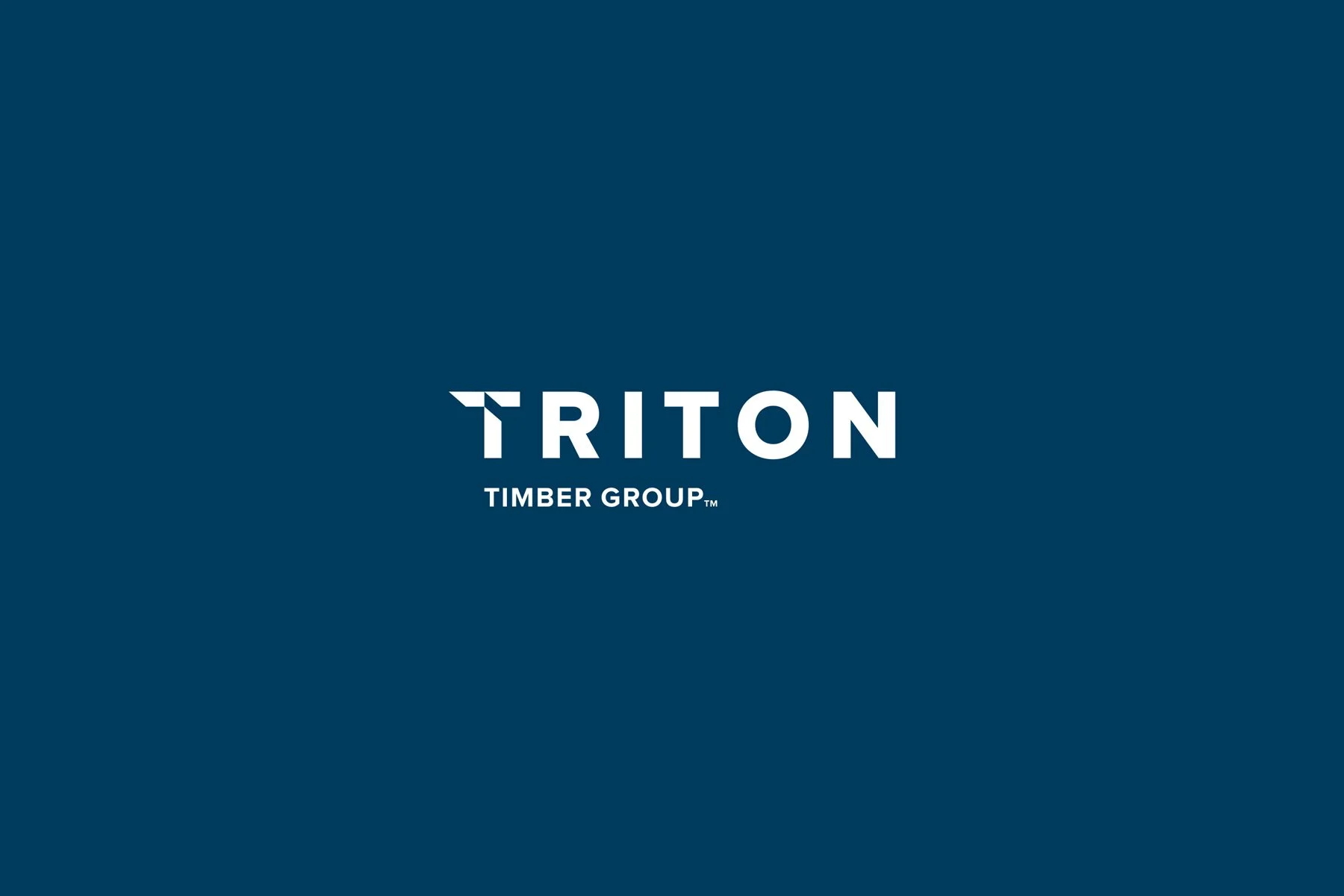
Current version of the brand
Founded in 2000 in Canada, Triton Timber Group is the world's leading company in the underwater timber industry. They develop patented technologies that allow the recovery of wood submerged at great depths in a safe and environmentally friendly way. This fibre is then converted into its best use, such as recovered wood or bioenergy products.


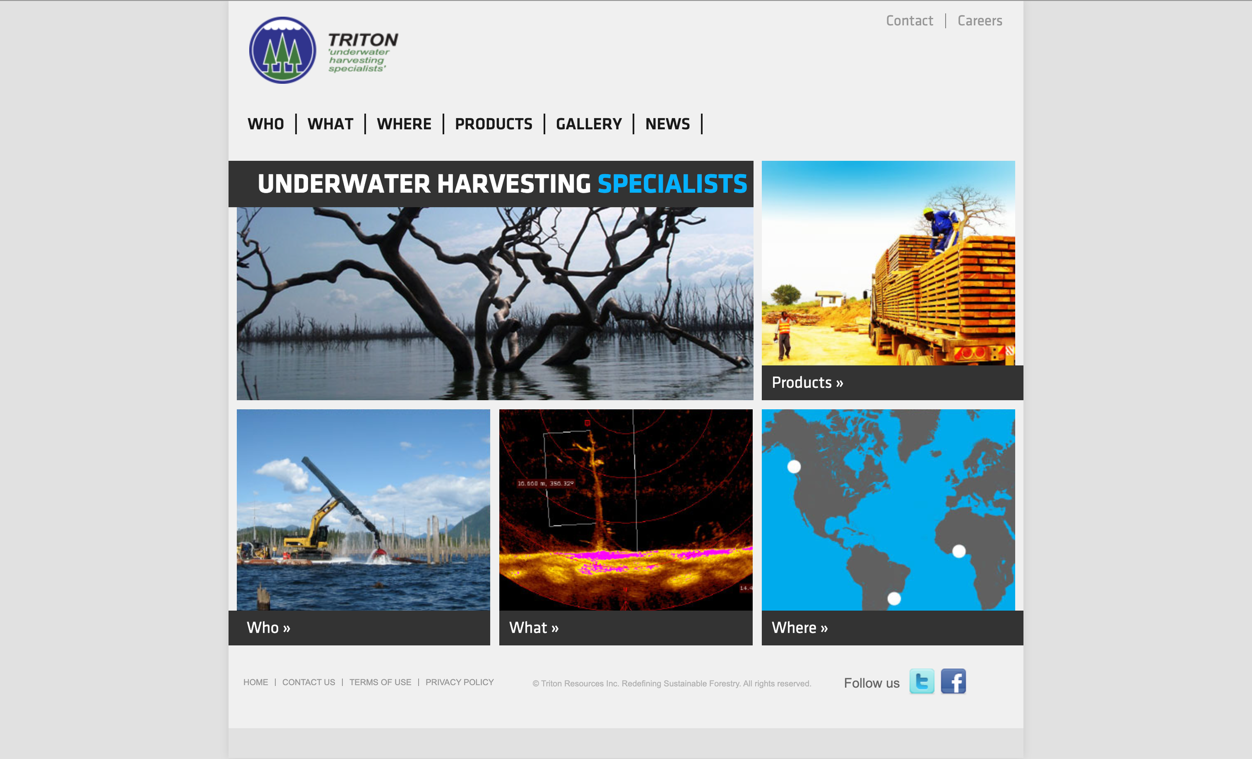
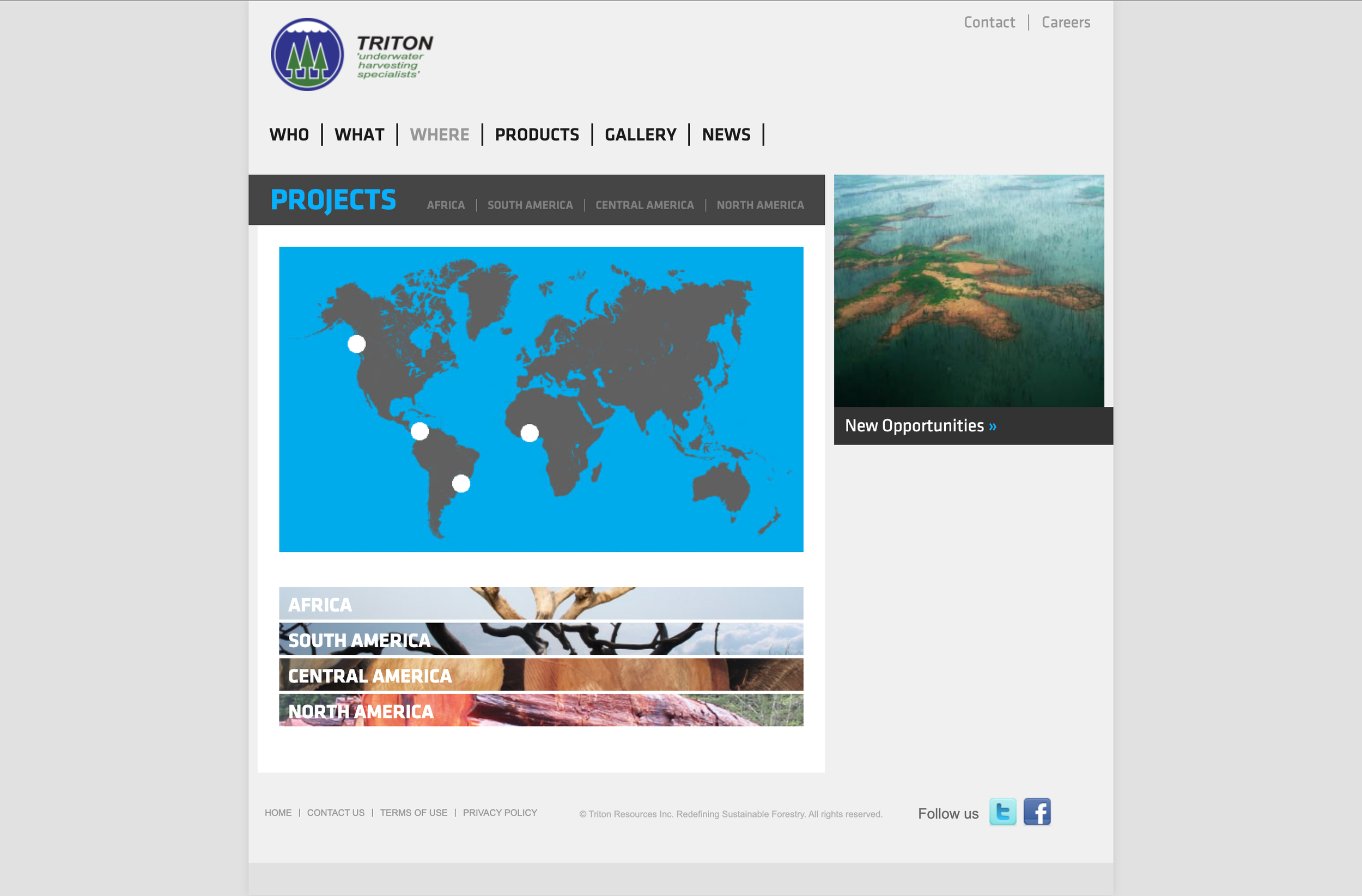
I also developed the brand's website, its entire information architecture and site map. Wireframes were designed for the mobile and desktop versions, including guidelines and some components such as: text styles, colors, sections, icons, menu box. The work was carried out in partnership with the developers and product manager
Previous version of the Triton website